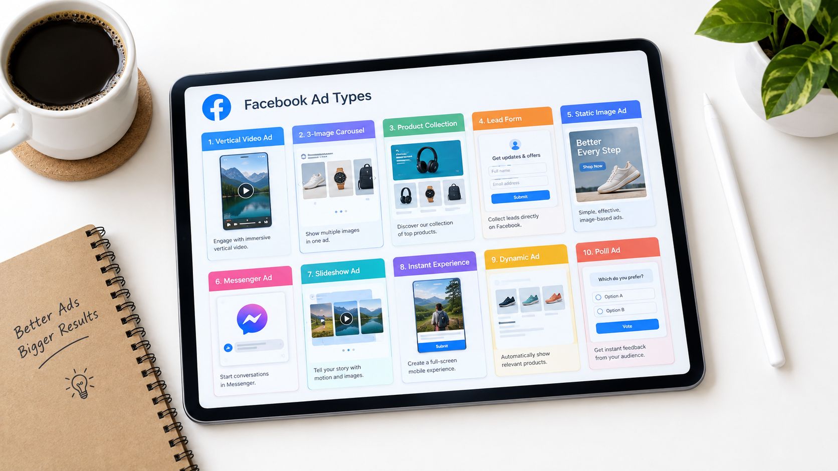


A marketing team asks for a Facebook ad that will “work,” and that's the wrong starting point. Pick the format by the goal, not the name. A sale, a qualified lead, a first WhatsApp conversation, and a brand story all need different Facebook ad types, different creative, and different follow-up.
That's especially true in India, where Facebook's potential ad reach still gives advertisers a large base to work from, with reach reported at 47.6% of India's internet-user base by January 2025 in DataReportal's summary of Meta advertising data (DataReportal India digital 2025). The practical question isn't which format sounds modern. It's which format moves someone from first contact to the next measurable step.
Use the ten formats below as a working brief. Each one is tied to a funnel job, the conversion action it serves, and the first creative test worth running.
Table of Contents
- 1. Click-to-WhatsApp Ads
- 2. Lead Ads
- 3. Advantage+ Catalog Ads
- 4. Carousel Ads
- 5. Collection Ads
- 6. Single Image Ads
- 7. Single Video Ads
- 8. Reels Ads
- 9. Stories Ads
- 10. Instant Experience Ads
- 10 Facebook Ad Types, Quick Comparison
- Turn Format Choices Into a Testing Plan
1. Click-to-WhatsApp Ads
Click-to-WhatsApp is the cleanest choice when the sale needs a conversation first. A tap opens WhatsApp, so the ad becomes the front door to qualification, booking, and follow-up instead of a dead-end click.
For a D2C jewellery or apparel brand, that might mean a “chat with a stylist” prompt that hands off to a human once the shopper shows intent. For a B2B service, it can be a “get a 15-minute audit” ad that asks for company size and use case before anyone books time.
Practical rule: use this format when speed of response matters as much as response volume.
What to test first
Open with a pre-filled message prompt that tells people what to type, then keep the first exchange short. Ask two or three qualifying questions, not a form's worth of friction. If your team can't reply quickly, the format loses value fast because the conversation cools off before it becomes pipeline.
Track the chat as a real funnel stage in the CRM, not just as a message volume metric. That lets you compare qualified conversations, booked calls, and closed purchases instead of celebrating chat starts that never move forward. For messaging campaigns tied to sales, this is usually the most direct bridge between paid media and follow-up.
2. Lead Ads
Lead ads work when you need contact details without sending people off-platform. The form pre-fills profile data, which lowers friction, and that makes them strong for demo requests, eligibility checks, event sign-ups, and other high-intent asks.
A software company can use this format for a “request a demo” flow with role and company-size questions. A lender can use it for a “check your eligibility” form that filters out poor fits before sales or servicing spend time on them.
What separates a strong lead ad from a weak one
The best lead ads don't ask for everything at once. They ask only for the fields that change the next step, then they make the thank-you screen do real work, like booking a call or opening a WhatsApp conversation. If the form is long, generic, or slow to route, it becomes cheap lead volume with poor follow-up quality.
A useful habit is to judge this format on qualified lead rate, not raw lead count. Two campaigns can have similar submission numbers, yet produce very different sales outcomes if one attracts people who are ready to talk. Connect leads to the CRM within minutes, because delayed follow-up is still one of the most expensive mistakes in this format.
A lead ad is only “cheap” if the follow-up is disciplined.
3. Advantage+ Catalog Ads
Catalog ads earn their place when the product range is the story. They pull items from a synced Meta catalog and show the right products to the right people, which makes them the core format for many ecommerce teams that need efficient order volume.
For retargeting, they're ideal for people who viewed a product or added it to cart but didn't buy. For prospecting, they can surface bestsellers or category sets that match a known interest pattern, which is useful when your store has enough variety to let the algorithm do some of the matching work.
What to watch before launch
Product feed quality matters more than many teams expect. Clean images, accurate titles, correct pricing, and current stock are not housekeeping tasks, they're performance inputs. If the feed is messy, the ad inherits the mess.
Keep prospecting and retargeting separate so you can see where incremental revenue comes from, and use a brand layer, like logo, offer, and value proposition, to make the catalog feel like your store instead of a generic marketplace grid. If you sell multiple categories, evaluate results by product set and return behaviour, not just by ad spend.
4. Carousel Ads
Carousel ads are the best fit when one image isn't enough to explain the offer. They let you show multiple cards in one swipeable ad, so you can compare products, sequence a story, or break a bigger decision into smaller steps.
A jewellery brand can show collections card by card. A B2B analytics firm can use the cards to walk through problem, solution, proof, outcome, and a demo CTA. That structure works because the user gets progress without having to leave the feed.
Where carousel works and where it doesn't
Carousel shines in mid-funnel moments when the buyer is curious but not ready to commit. It's also a strong choice for categories with distinct variants, because each card can point to a different page instead of forcing every click through the homepage.
The weak version is a carousel where each card looks like a random asset dump. The strong version has a visual rhythm and a first card that earns the swipe. Keep the benefit on each card short, and send each card to a destination that matches its promise.
If every card goes to the homepage, the carousel is wasting its own structure.
5. Collection Ads
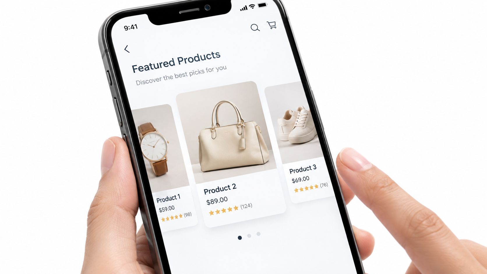
Collection ads are built for mobile browsing when product discovery needs more space than a standard ad. They combine a large hero image or video with product tiles underneath, then open an Instant Experience storefront when tapped.
That makes them a strong choice for fashion drops, home decor, footwear, and other visually-led categories where range matters as much as one hero item. A footwear brand can use a launch video at the top and a grid of styles below. A home decor brand can show a room scene and let people move into category browsing without leaving the app.
The best collection ads feel like a compact storefront, not a cluttered promo sheet. Use the hero creative to name the collection quickly, then choose grid products based on intent. Bestsellers work for cold audiences, while complementary items make more sense for retargeting.
Creative discipline matters here
If the product images clash, the grid looks sloppy and the ad feels cheaper than it should. Keep backgrounds and crops consistent, check how the Instant Experience performs on low-end Android devices, and make sure product-level events are set up before launch. If you can't tell which tile drove the add-to-cart or purchase, you're flying blind on merchandising.
The right use case is mobile discovery with enough inventory to support choice. The wrong use case is a single-product campaign pretending to be a storefront.
6. Single Image Ads
Single image ads are still the control creative for a reason. They're fast to build, easy to test, and clear enough to isolate whether the offer, the audience, or the visual is doing the work.
A D2C skincare brand can test a product packshot against a lifestyle image. A consultancy can run a simple branded image with a benefit-led headline and a direct assessment offer. In both cases, the format forces clarity.
Why media buyers still rely on them
The single image ad is the cleanest way to start a test because it removes extra moving parts. When a campaign underperforms, you need to know whether the idea is weak or the execution is weak, and this format makes that easier to read.
Use a strong focal point, keep the image text-light, and let the headline carry the message. If you're testing multiple concepts, change only one variable at a time. A single-image control also gives you a baseline for judging whether video, carousel, or Reels adds real value.
7. Single Video Ads
Single video ads are the main choice when motion does the explaining. They're useful for demos, problem-solution stories, product walk-throughs, and quick proof points that need more than a still frame.
A SaaS team can use a short explainer that shows the workflow problem and the software fix. A kitchenware brand can show a product in use, then end with the offer. The format is especially strong when the first few seconds do the heavy lifting.
What good video does differently
People often watch with sound off, so captions and on-screen text aren't optional. The hook needs to land fast, the brand needs to appear early, and the cut should stay tight. Long intros are the enemy here.
Produce multiple lengths from the same shoot if you can, because the same story often behaves differently at 15 seconds than it does at 30 or 60. Then judge the ad by what it leads to, not just by how many views it earns. If the video gets attention but doesn't move people into the next action, the story is too loose or the CTA is too weak.
Good video gives the audience one reason to care, then one reason to act.
8. Reels Ads
Reels ads fit the funnel when you want immersive reach in a short-form environment. They should feel native to the feed, which means vertical framing, fast pacing, creator-style delivery, and text that can be read instantly.
A snack brand can use creator-style unboxing footage with a direct offer. A training company can run a “three mistakes” Reel that links to a checklist. The point is not polish for its own sake, it's to make the ad look like content people already choose to watch.
How to brief Reels properly
Design for 9:16 from the start and keep key visual elements away from the CTA and overlay areas. The first two seconds matter most, and the ad usually performs better when it feels like a person speaking to another person, not a brand reciting copy.
Test a native-style version against a more polished cut if you have both. Sometimes the scrappier one wins because it matches the environment better. Reels also gives you a vertical asset that can be reused in Stories, which helps when production time is limited.
9. Stories Ads
Stories ads are the right choice for quick, full-screen attention with a clear action attached. They work well for flash offers, event pushes, and short sequences where each frame can advance the message one step at a time.
A fashion brand can use three frames to drive a 24-hour sale. A regional event organiser can use a short video, a date reminder, and a registration CTA. The format is sharpest when the offer is easy to understand in one glance.
What makes Stories convert
Keep each frame to one message. If you try to tell a whole brand story in one story frame, the format stops behaving like a fast action tool and starts behaving like clutter.
The CTA needs to show up early and again at the end, and the landing page has to match the promise exactly. If you're retargeting, watch frequency carefully, because Story ads get tired quickly when the same audience sees them too often. A three-frame sequence is worth testing against a single frame when the message needs pacing.
10. Instant Experience Ads
Instant Experience ads are the closest thing to a lightweight landing page inside Facebook or Instagram. When someone taps the ad, a full-screen mobile experience opens with images, video, text, carousels, and buttons all in one place.
That makes them useful for brands that want more story space without sending every click to a separate website page. A furniture brand can use one to show a scrollable lookbook. A financial services team can use it to explain loan options before the lead form appears.
Treat it like a page, not a poster
Start with the offer, keep the number of sections tight, and match the visual identity to the website so the experience feels connected. If the experience takes too long to load on a normal mobile connection, the idea has already failed the first test.
Compare it against a mobile landing page before scaling. In some accounts, the in-app experience reduces friction. In others, the dedicated page converts better because it gives you more control over the final action and the measurement setup. The only safe answer is to test the pair against the same offer.
10 Facebook Ad Types, Quick Comparison
| Ad Format | 🔄 Implementation complexity | ⚡ Resource requirements | 📊 Expected outcomes | 💡 Ideal use cases | ⭐ Key advantages |
|---|---|---|---|---|---|
| Click-to-WhatsApp Ads | Medium, Ads Manager + WhatsApp Business verification and routing | Moderate, chat agents, chatbot/CPaaS, CRM integration | High-quality real-time leads; conversion tied to reply speed | D2C order capture, B2B demo booking, re‑engagement | Direct ad→conversation path; fast qualification; strong in WhatsApp‑first markets |
| Lead Ads (Instant Forms) | Low–Medium, build form in Ads Manager; privacy link required | Low, no landing page but needs rapid CRM ingestion | High lead volume with higher completion; intent varies by offer | B2B webinars, demo requests, event registration, pre‑qualify loans | Prefilled fields reduce friction; fast to launch; built‑in lead optimisation |
| Advantage+ Catalog Ads (Dynamic) | Medium–High, product feed, Pixel/CAPI and catalog setup | High, feed maintenance, accurate SKUs, substantial conversion data | Scalable orders; efficient retargeting; lower CPA if data clean | D2C ecommerce, cart retargeting, prospecting large catalogues | Scales across SKUs; automated product selection; strong retargeting efficiency |
| Carousel Ads | Medium, create 2–10 coherent cards and links | Moderate, multiple images/videos and card copy | Multi-message engagement; CTR concentrated on early cards | Showcasing ranges, stepwise B2B flows, testimonials | Multiple messages in one unit; user choice; good for complex offers |
| Collection Ads | Medium–High, hero + catalog grid and Instant Experience linkage | High, hero creative, product tiles, catalog upkeep | On‑platform browsing; higher discovery→consideration conversion | Mobile-first discovery, seasonal launches, brand‑led shopping | Combines storytelling and shoppable grid; keeps users in app |
| Single Image Ads | Low, simplest ad setup | Low, one high‑quality image and copy | Fast learnings; reliable baseline metrics; variable impact by visual | Quick offers, creative tests, simple retargeting | Fast, inexpensive, easy to iterate and test |
| Single Video Ads | Medium, video production and optimisation for placements | Medium, production, captioning, multiple cuts | Strong engagement and recall; good for demos and explainers | Product demos, B2B explainers, top‑funnel storytelling | Motion demonstrates use; high attention when hooked early |
| Reels Ads | Medium, vertical short‑form native creative required | Medium, vertical video production; creators optional | High reach with younger audiences; performance depends on native feel | Product launches, creator campaigns, app installs | Immersive, native short‑form placement; scales short‑form content |
| Stories Ads | Low–Medium, vertical slides or short videos, can sequence frames | Moderate, vertical assets and sequencing | High attention for time‑sensitive CTAs; rapid responses | Flash sales, event promos, sequenced storytelling | Full‑screen urgency; effective for time‑limited offers and retargeting |
| Instant Experience Ads | High, design modular full‑screen mobile experience | High, multiple assets, product sets, UX testing and speed checks | Richer on‑platform conversion; lower bounce than slow pages | Lookbooks, mobile landing pages, richer lead capture | Deep storytelling without leaving app; high layout control |
Turn Format Choices Into a Testing Plan
Choose one Facebook ad type for the goal you're funding this month, then run it against a single-image control and judge it on cost per order or cost per qualified lead, not on reach. That discipline matters because broad reach can look impressive while the sales handoff stays weak, and a smaller, more targeted format can produce better commercial output when the creative and destination are aligned.
For India-focused campaigns, the planning range is broad enough that format choice really does matter. Meta's advertising tools reportedly indicated Facebook ad reach of about 403 million people in India in late 2025, with 8.1% year-over-year growth, while independent India benchmark summaries place typical CPM around ₹50–₹150, CPC around ₹2–₹25, and CPL around ₹50–₹500 for planning purposes (India Facebook ad benchmark summary). Those numbers are useful as guardrails, but they don't replace qualification quality, CRM matching, or downstream sales data.
Feed every result back into the next brief. Strong comments, chat questions, and form completions show which messages deserve another round, while weak completion rates point to a poor offer, a poor landing page, or a poor follow-up path. That's the loop TVL Media builds into Strategy, Create, Grow, and Build, because the next creative should come from what the last campaign taught you, not from a guess.
TVL Media helps brands choose the right Facebook ad types, then connect them to CPaaS follow-up, landing pages, and pipeline measurement. If you want paid media that's judged on cost per order or qualified pipeline, visit TVL Media and see how the team turns ad insights into the next creative, the next message, and the next conversion path.